Introduction
Applying multiple shadow effects to text in CSS allows you to create layered, dynamic, and visually striking text. Using the text-shadow property, you can apply more than one shadow to a single text element to simulate various effects like glowing, depth, and more.
In this tutorial, you'll learn how to apply multiple shadow effects to text using the text-shadow property in CSS.
Problem Statement
Create a CSS code that:
- Applies multiple shadow layers to text using the
text-shadowproperty. - Demonstrates how to control the offset, blur, and color of each shadow layer.
Example:
- Input: A heading element with the text "Multi-Shadow Text Effect".
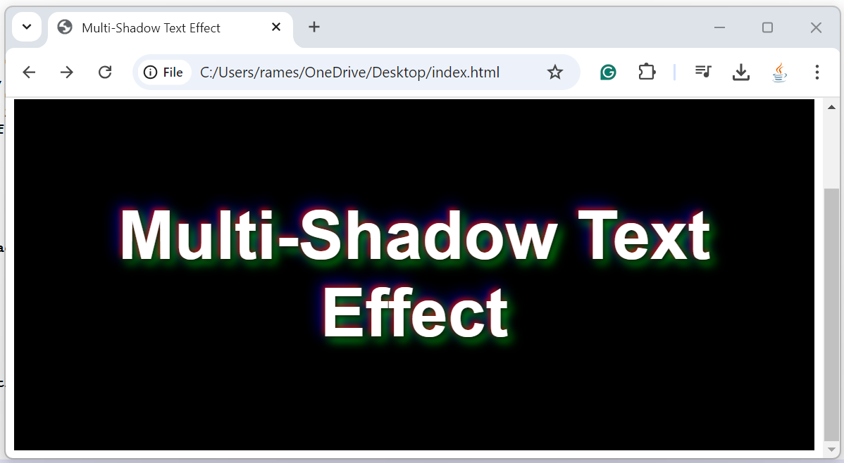
- Output: The text appears with multiple shadow effects applied, creating depth and style.
Solution Steps
- Use
text-shadowProperty: Apply multiple shadows to text by listing them within thetext-shadowproperty, separated by commas. - Control Shadow Offset, Blur, and Color: Adjust the offset, blur radius, and color of each shadow layer to create the desired effect.
HTML Structure
<!DOCTYPE html>
<html lang="en">
<head>
    <meta charset="UTF-8">
    <meta name="viewport" content="width=device-width, initial-scale=1.0">
    <title>Multi-Shadow Text Effect</title>
    <style>
        /* Step 1: Create multi-shadow effect using text-shadow */
        .multi-shadow-text {
            font-size: 4rem;
            color: white;
            text-shadow:
                2px 2px 5px rgba(0, 0, 0, 0.7),  /* First shadow - subtle black shadow */
                -2px -2px 5px rgba(255, 0, 0, 0.7), /* Second shadow - red */
                4px 4px 10px rgba(0, 255, 0, 0.7), /* Third shadow - green */
                -4px -4px 15px rgba(0, 0, 255, 0.7); /* Fourth shadow - blue */
            font-family: Arial, sans-serif;
        }

        /* Center the text container */
        .container {
            text-align: center;
            margin-top: 100px;
            background-color: black; /* Background for contrast */
            padding: 50px;
        }
    </style>
</head>
<body>

    <div class="container">
        <h1 class="multi-shadow-text">Multi-Shadow Text Effect</h1>
    </div>

</body>
</html>
Explanation
Step 1: Use text-shadow for Multiple Shadows
To create a multi-shadow effect, list multiple shadows within the
text-shadowproperty, separated by commas:.multi-shadow-text { font-size: 4rem; color: white; text-shadow: 2px 2px 5px rgba(0, 0, 0, 0.7), /* Black shadow */ -2px -2px 5px rgba(255, 0, 0, 0.7), /* Red shadow */ 4px 4px 10px rgba(0, 255, 0, 0.7), /* Green shadow */ -4px -4px 15px rgba(0, 0, 255, 0.7); /* Blue shadow */ }Each shadow is defined by:
- Offset (x, y): Moves the shadow horizontally and vertically.
- Blur radius: Softens the edges of the shadow.
- Color: Sets the color and opacity of the shadow using
rgba().
Step 2: Customize the Shadows
- You can create different visual effects by adjusting the color, blur radius, and shadow offsets. For example, increasing the blur radius gives a softer, more diffused shadow, while different colors create a layered effect.
Step 3: Add Background for Contrast
- A dark background helps to emphasize the shadows and make the layered effects more visible.
Output
Conclusion
Creating multi-shadow effects with CSS is easy using the text-shadow property. By layering multiple shadows with varying offsets, blur radii, and colors, you can achieve dynamic and visually engaging text effects that add depth and creativity to your designs.


Comments
Post a Comment
Leave Comment